Design
Coddiwomple Art
Branding, UX Design & Front-End Development
Coddiwomple
verb
To travel purposefully toward an unknown destination.
About the Project
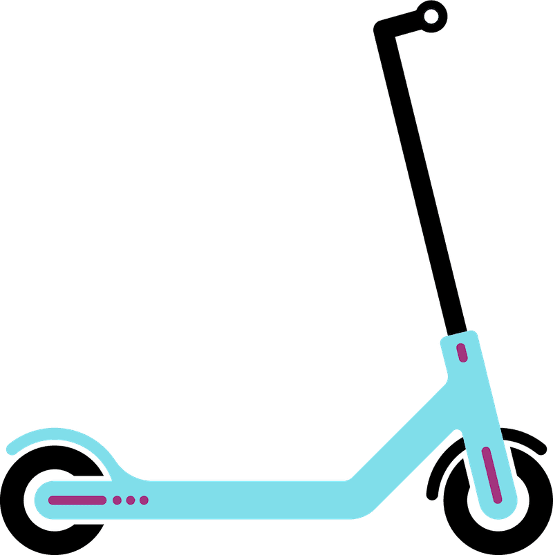
Coddiwomple Art is an education brand built around creative learning experiences for children. I developed the visual identity, website, user experience, and front-end implementation while shaping the brand around a sense of curiosity, movement, play, and purposeful exploration.
My Role
I led the project from concept through implementation, including brand direction, color palette, typography, logo and mascot development, information architecture, responsive interface design, enrollment flow, and the Next.js front-end build.
Brand System
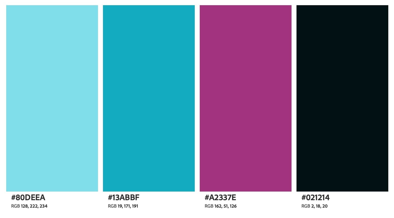
Color Palette
The palette combines bright cyan and berry tones with a deep near-black anchor, giving the brand enough energy for children while keeping the overall system clean and contemporary.
Typography
Display Typeface
MuseoModerno
Aa Bb Cc
1234567890
Brand Use
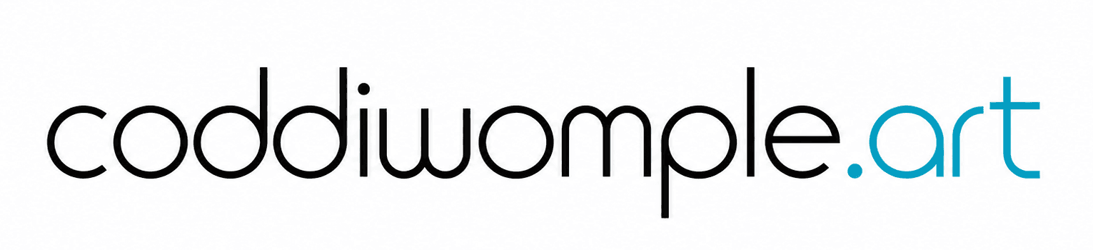
MuseoModerno provides the geometric foundation for the Coddiwomple Art visual identity. The custom wordmark builds on those forms with modified letterforms, including an inverted “m” used to create the “w.”
Wordmark
Scooter Mascot
Print & Promotional Assets
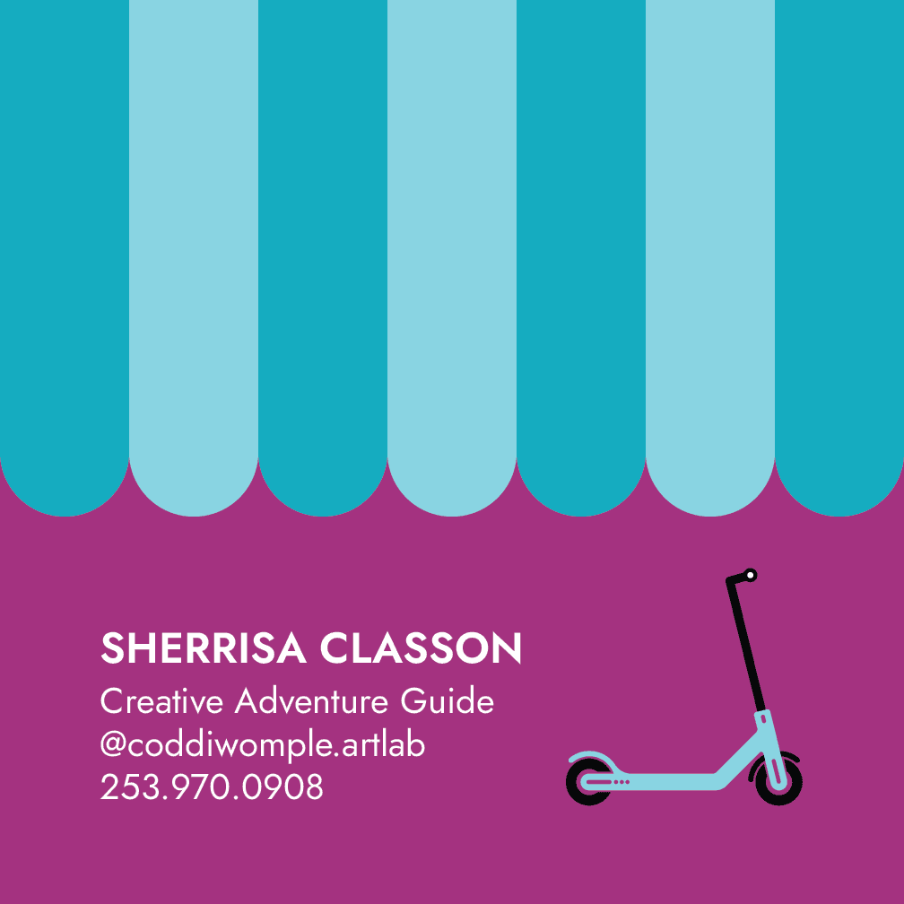
I extended the Coddiwomple Art identity beyond the website into print and promotional materials. These pieces needed to feel consistent with the digital brand while also working clearly and effectively in physical spaces.
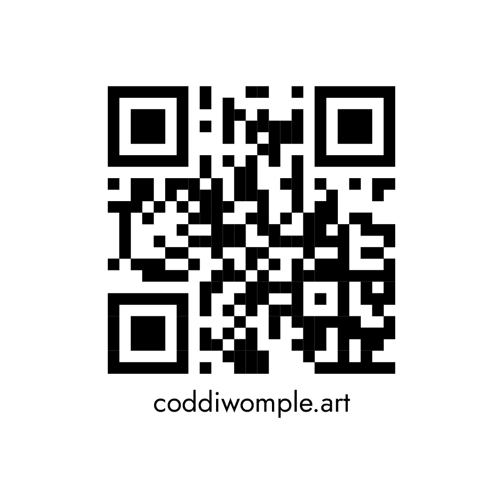
QR-based materials connected print pieces directly to the online experience, creating a simple path from in-person promotion to course information and enrollment.
Website & UX
One of the clearest UX decisions came from the course call-to-action. I started with a conventional button, but it felt too much like a generic software interface for a brand built around creativity, exploration, and discovery.
I replaced the button with a stronger berry-colored text link and used motion as the visual cue instead. The interaction evolved into a wandering dot following a curved path beneath “Explore the courses →,” creating a more distinctive invitation to move deeper into the site.
Explore the courses
The final interaction uses restrained motion to attract attention without overpowering the content, reinforcing the brand’s idea of purposeful exploration.
Reflection
Building Coddiwomple Art required balancing personality with usability. The brand needed to feel playful enough for a children’s creative program while still feeling trustworthy and clear for the adults making enrollment decisions.
The project also gave me the opportunity to move fluidly between strategy, visual design, UX, content structure, and front-end implementation rather than treating those disciplines as isolated steps.